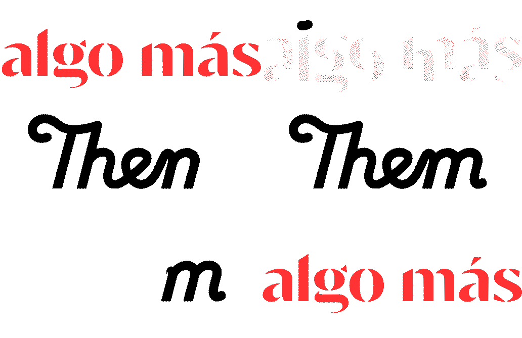
Comic Sans Sucks, Or Why Typography Is Important To Your Brand
August 6, 2019
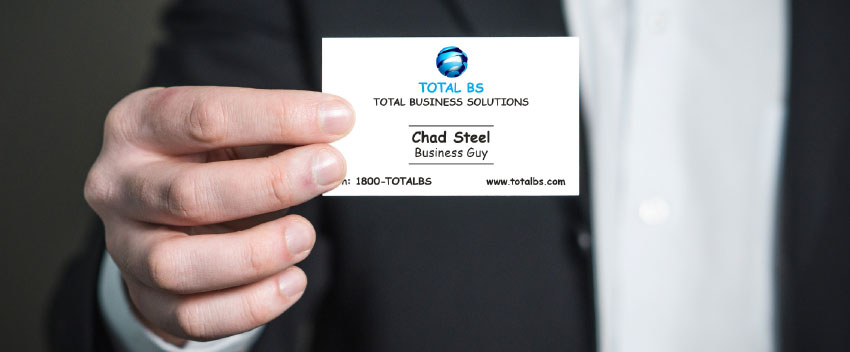
You’ve made a new business contact, and you exchange cards. Glancing at your new contact’s card, you notice, to your horror, its carefree use of… Comic Sans.
The importance of typography
Whether you realise it or not, you’ve just formed an opinion of a brand – based on typography.
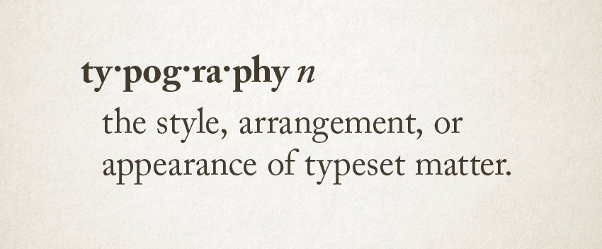
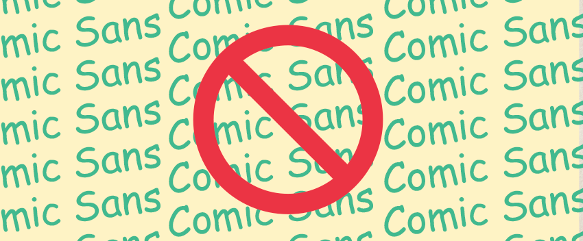
Typography (and its components – fonts or typefaces) is an often overlooked part of visual communication, despite being a major element of a brand. It is used in logos, headings, text – in basically every piece of communication, and can significantly contribute to the effectiveness of your brand. Used properly, it can grab and hold the audience’s attention, and get viewer on board with the message you’re putting out there. Used improperly, it can confuse, annoy and even cause the viewer to ignore. Speaking of improper typography, Comic Sans is a very popular font (partly due to it being available as a core font on Windows-based computers), despite being quite a poor example of a comic book style font. It’s best used on quick invitations to kids’ parties, and not a lot else!
What do the big brands use?
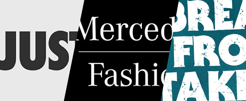
What style of type does Nike use in their communications? Mercedes-Benz? How about Farmer’s Union Iced Coffee? Chances are you have some idea of the fonts these brands use, and they contribute to your impression of the brand. Nike uses condensed (narrow), bold capitals to convey power and confidence. Mercedes uses an elegant serif to reflect their prestige and history. And of course, Farmer’s Union use a funky old-school font to communicate their own history and attitude (that is also used for many 1970s horror movies!)
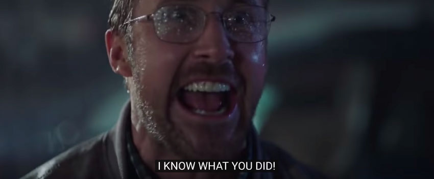
For some of us, typography can be an obsession (I’m guilty of this). It can make us jealous, or make us flip out a little. Here Ryan Gosling going super-deep about the Avatar logo, and its shameful use of a much-reviled font, Papyrus.
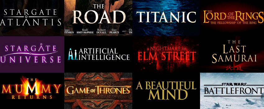
Speaking of movie fonts, there’s one in particular that everyone is familiar with.
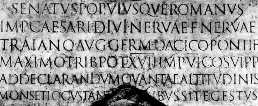
Trajan is the go-to font for blockbusters, and has been for decades. But its use goes back even further – over 2000 years in fact. The ornately-carved, 30-metre high Trajan Column in Rome commemorates Roman emperor Trajan’s victory in the Dacian Wars in the years 101 – 106, and was completed in 113, bearing an inscription in the original version of Trajan. The column’s carvings also features some pretty dramatic scenes of battle, imperial address, sacrifice and torture… so it’s fitting that it’s the font of choice for cinema!
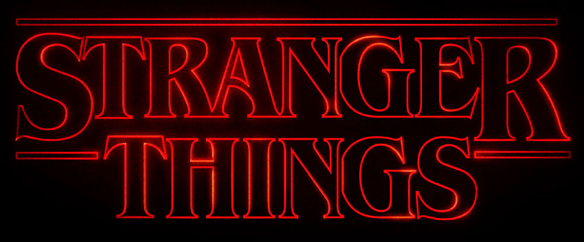
Another font that’s been dusted off and thrust back into the limelight is ITC Benguiat – if you’ve seen the Netflix show Stranger Things, you’d recognize it as the logo that perfectly encapsulates the 1980s horror vibe (with a distinct Stephen King feel) of this hugely successful show.
I hope I’ve gotten you a little more interested (if not excited!) about fonts and their use. Maybe you’ll notice interesting and effective typography a little more (and apologies if you notice Comic Sans more too!) As you can see, typography can influence the tone, understanding and intent of a written message. So treat your reader to fonts that are aligned with your brand values, and please contact us if you need assistance reviewing the use of typography in your brand.
See some of our branding work and the importance of typography here.
…and remember, Comic Sans sucks!
