Rebranding: ‘Who’ Is Your Brand?
September 8, 2020
The easiest way to understand a lot of things in life is to humanise the experience – and branding is no different. Have you ever thought about your brand as a person and considered who they would be? What they would look like? How they would talk? What they would wear? How they would behave? What they would – and wouldn’t do? The person you imagine may be loud and proud or refined and understated: either way, the identity you create must appeal to the target audience you wish to attract. By investing time in crafting an authentic persona for your brand, it has the potential to become more likeable, relatable and credible in the minds of your consumers. They will ‘see’ themselves reflected in your brand – and people buy from brands they like and trust.
In today’s cluttered market, you don’t have long to grab people’s attention. As ruthless as it sounds, first impressions count in business so your brand must make a good one. If you have ever invested money promoting your brand using outdoor advertising, television, social media, or some other means of communication, you are sending a message to consumers about your brand. This is the part of the equation you can control and it is where your influence ends. What happens next, and the impression you create in the market, is decided by your consumers who will form conscious, and unconscious, views of your brand.
When a customer engages with a brand, its essence then comes to the fore. Consumers look past the initial visual impression and turn their attention to the brand’s values to see if they align with its outward impression. This can be defined as the personality of the brand – the tone with which communications are delivered and the values that are projected. It’s the alignment of these two sides – the external and internal – which determine a brand’s success. This alignment comes down to credibility; does the business do what it says it will do?
Rebranding involves revisiting a company’s values and goals as well as the logo and other visual assets to make sure all elements align. Businesses often need to rebrand and it can be a result of many reasons including international growth, new management, a scandal (or bad reputation) or an outdated image.
There have been some major rebrands in the past few years that can give some insight into how global companies are evolving to stay in the game. Let’s look at a few of these brands and review their logos and visual elements to see what worked, and what didn’t, when they were refreshed. Of course, a brand is more than a logo and its visual attributes but, as a Graphic Designer, these are the elements that I’m most invested in.
Rebranding: Uber
Uber burst onto the scene in 2009 as the first ridesharing service and has become both the verb and the noun for the rideshare industry. After a lot of bad press over the past few years, and ditching their CEO, the company decided to rebuild the company’s reputation with a rebrand.
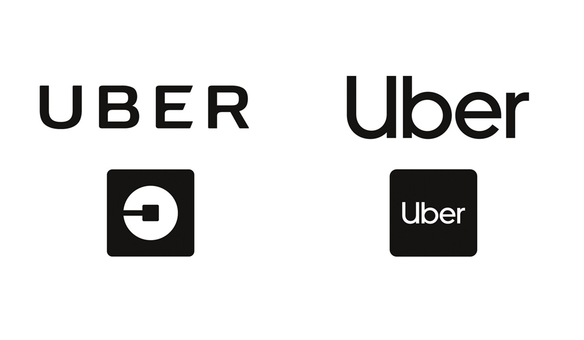
Uber’s old brand was bold but unfriendly. The letters had inexplicable rounded corners (that make our designers cringe) and had a strange app icon that was disconnected from the rest of the brand.
The new logo is more friendly and approachable using lowercase letters (even a lowercase u used as a capital U). The new logo still retains a mainly black and white colour palette and the new app icon is simply the logo; rather than a U.
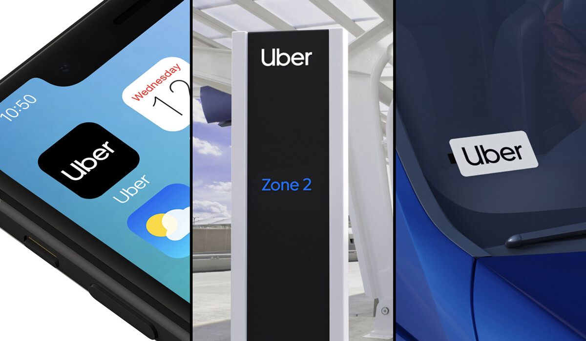
The new visual identity is a move in the right direction for a company that had been heading the wrong way. And it seems to have paid off with a much improved public opinion of the Uber brand.
Rebranding: Heinz
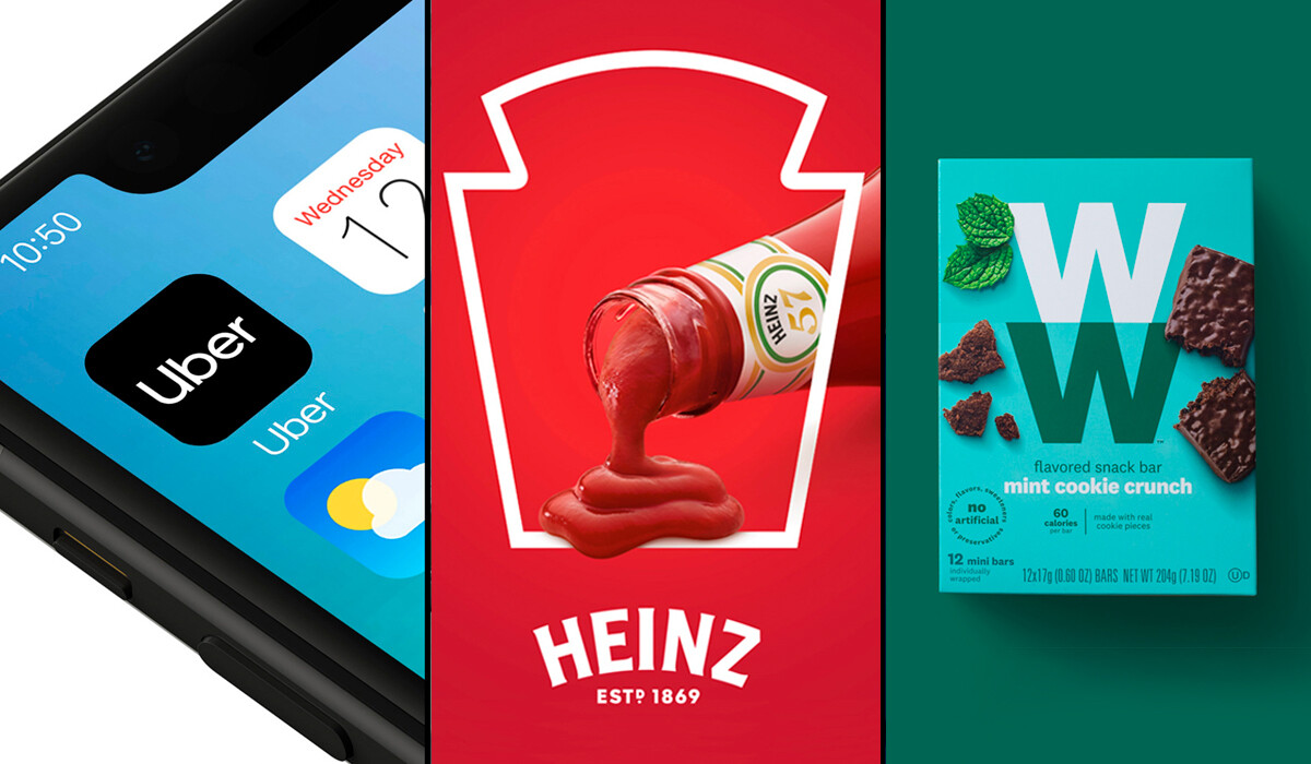
Heinz needs no introduction. The company has been ‘part of life’ for millions of Australians for more than 100 years. The company recently introduced a new overall ‘master’ brand identity to replace the (many) others it had in its product stable. Over the years, the look of individual products had been inconsistently applied across various markets which created the need for a new, cohesive master brand identity.
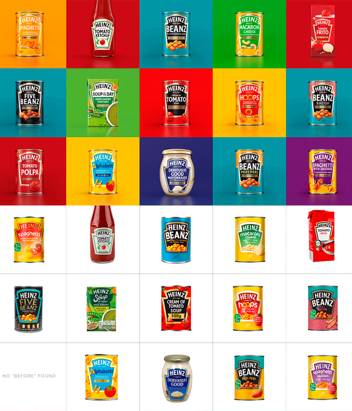
The iconic keystone shape is retained and is now applied consistently across all Heinz products. The many different fonts used previously have been culled and now use, almost exclusively, the master Heinz font ‘Label Sans’.
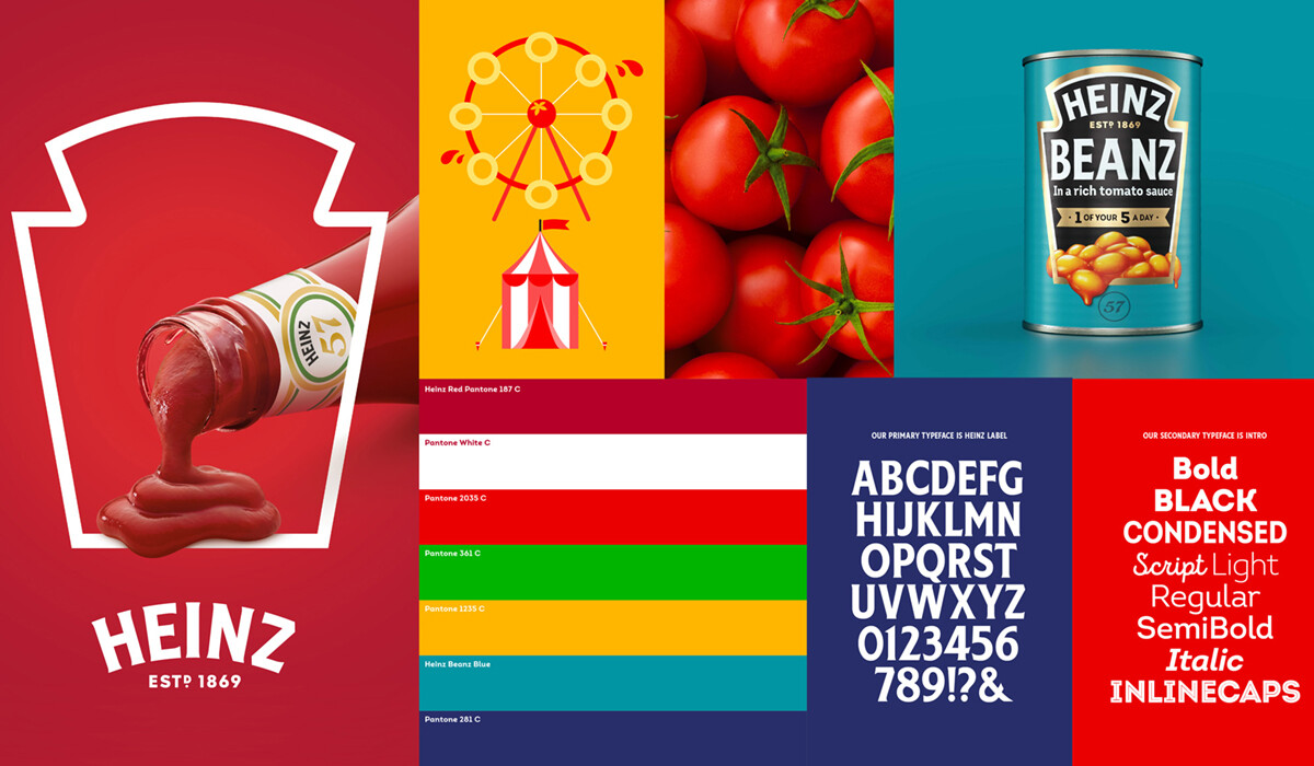
This refresh collects all the classic elements of the Heinz brand and consistently delivers a look and feel that is unmistakably Heinz.
Rebranding: Weight Watchers
Weight Watchers is a weight management program that has been around since the mid-1960s. The brand has been through a couple of iterations in the past decade, most recently in 2012, when it switched to an all-lower-case, bold style.
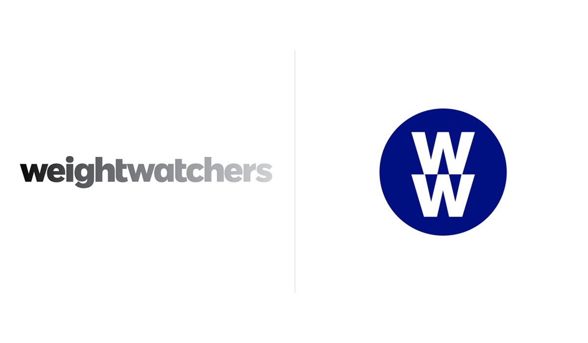
After 55 years of being called Weight Watchers, the company recently made a sharp change in its business model and shifted its focus from weight loss to healthier lifestyles and body positivity. This resulted in the company dropping the Weight Watchers name and using the initials WW because the name no longer aligned with the brand vision. I’m sure the company expects people to keep calling it ‘Weight Watchers’ rather than ‘Double U Double U’ – three syllables versus six! The new brand includes the tagline ‘Wellness that Works’ further reflecting the WW name.

Product packaging is almost unrecognisable compared to previous versions. These changes led to significant criticism from within their core market. Consumers were confused about the new name, look and direction for the company. Current customers didn’t renew memberships, and the company didn’t attract new members, which lead to poor financial performance. Over the next year, sales declined considerably.
Uber and Heinz successfully refreshed their visual identities to simplify, reinforce and grow their brands.
WW executed its rebranding too abruptly and too quickly and ended up alienating its existing customers to the detriment of the overall brand.
So what can we learn from these examples and how can you work with a design team when rebranding? Here at Algo Más, we specialise in branding (including rebranding) and can work with you to elevate your brand to be the best version of itself.
Recognising when it’s time to rebrand doesn’t have to be difficult. Keep a consistent look that visually communicates who your company is – and take your customers on the journey with you. If you already have a great brand identity, getting rid of it could be the wrong move. Keep what works and ditch what doesn’t.
Interested in creating a new brand or rebranding? Explore our branding portfolio.
Image credits: www.underconsideration.com/brandnew
Article by Dave English, Graphic Designer, Algo Más
