Brands Of Westeros
May 17, 2019
The team at Algo Más, like a lot of other people, are currently obsessing, theorising and fantasising about how the worldwide pop culture phenomenon, Game of Thrones, is going to end.
While the show itself has really effective marketing and promotion making it one of the biggest, if not THE biggest, television shows of all time I have always been a fan of the branding and the eye catching graphic design within the fictional world of Westeros.
Each noble house in Westeros has a sigil, the unique symbol of that house. Not unlike a coat of arms it tells and sells the history of that house and represents their values and what they are known for throughout the kingdom. Essentially the sigil is the brand of that house and some houses, just like a business or organisation in the real world, have good brands and some have bad brands.
Let’s discuss some of the better brands of Westeros in my opinion…
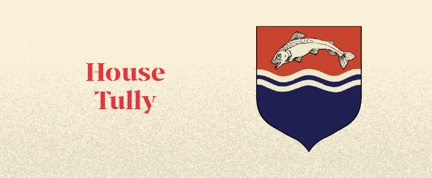
House Tully
One of the great houses of Westeros, Tully’s sigil consists of a leaping trout on a background of red and blue. This sigil perfectly represents what that house is about, as the lords of the riverlands, they are all about fish and the river. Its colouring also makes it stand out a bit more than the other sigils with the blue wave making the fish more dynamic and adding a sense of movement. Overall the elements combine to make one of the more visually interesting brands in Westeros.
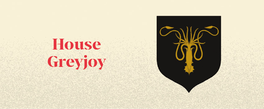
House Greyjoy
The Greyjoys rule the Iron Islands and aren’t really a pleasant bunch. They are the masters of the seas and their sigil is a perfect symbol for this, a powerful golden Kraken on a dense black background. The Greyjoy’s brand of nautical chaos is appropriately conveyed with the Kraken, a creature of legend stalking the world’s seas. The Kraken’s tentacles elegantly fill the space and along with its symmetry combine to make a visually striking image.
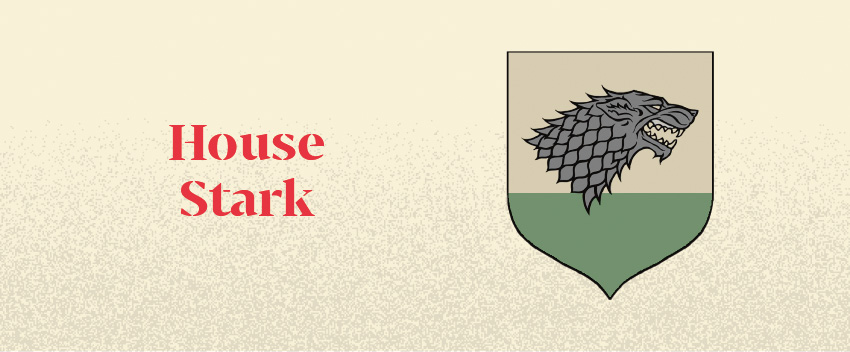
House Stark
The Starks of Winterfell are known for being the honourable lords of the North – what better way to show that to the world than with a fierce direwolf as your brand. The direwolf, like the Starks, are extremely loyal, honourable and great warriors. This representation of the direwolf’s head is beautifully ornate, capturing the ferocity and pride of the noble beast in all its glory.
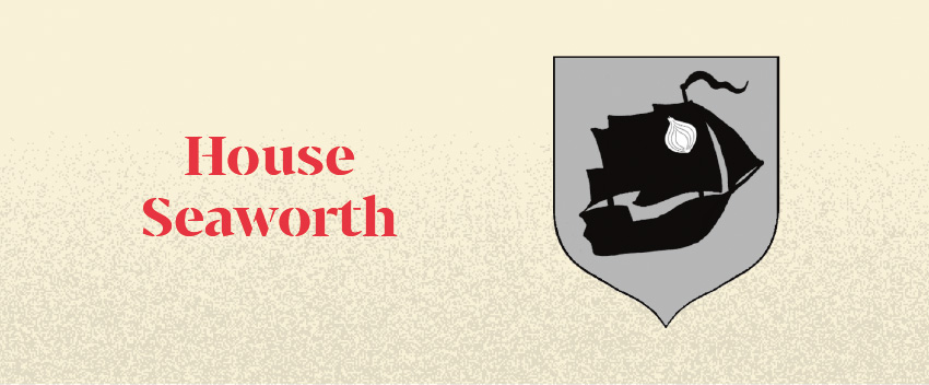
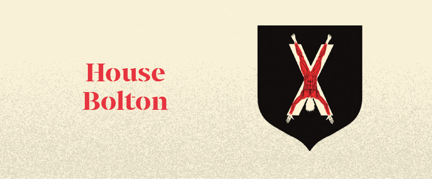
Honourable Mention – House Seaworth and House Bolton
The most straightforward and no-nonsense brands in Westeros go to Houses Seaworth and Bolton. These are both extremely accurate graphic representations of what these two houses are known for. First Ser Davos Seaworth is notable for his fondness of smuggling onions by boat – so it makes perfect sense his brand is an onion on a boat.
The deranged folks over at House Bolton have a macabre graphic for their sigil showing a man removed of his skin crucified on a large X, which is the traditional pastime that the Bolton’s enjoy inflicting on their enemies. So having this as a logo makes total sense.
Valar Morghulis…